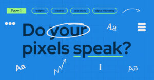
In today’s fast-paced marketing landscape, digital design is evolving faster than ever. The most effective brands aren’t just chasing trends.
They’re mastering the art of balance.
Modern design language blends data-driven clarity with a distinctly human touch, ensuring that brands feel both trustworthy and approachable.
Minimalist grids meet organic shapes. Bold, accessible typography lives alongside conversational language. Clean interfaces are paired with vibrant accent colors that express personality. This is the sweet spot where a brand can be both intelligent and relatable. It’s precisely the approach we took when reimagining the Response Labs website.
Why Balance Matters in Digital Design
Digital design isn’t just about looking good, it is, by its nature, functional. Digital design is about making every interaction intuitive, relevant, memorable, and ultimately actionable. The brands that succeed in this space communicate two key things:
Authority: They know their stuff and can be trusted to deliver results.
Humanity: They understand people, not just numbers.
Leaning too far into technical minimalism risks feeling cold and inaccessible. Swing too heavily into casual, human-centric design and you risk losing credibility. That’s why, when looking to refresh the Response Labs website our rebrand started with a single guiding principle: blend the human and the digital into one cohesive identity.
The Response Labs Website: A Case Study in Balanced Design
When we set out to rebrand, we weren’t just refreshing a logo or updating colors; in fact, the logo hasn’t changed. We were reframing how our brand communicates in a digital-first world.
Human at the Core
Our creative elements of hand-drawn arrows, brush strokes, and loose shapes anchor our brand in humanity. They remind visitors that behind every AI-powered insight is a team of curious problem solvers. These organic touches are strategically placed to break up the rigidity of digital layouts, making complex ideas more approachable.
Precision in the Details
Our grid system, modern sans-serif typography, and streamlined navigation are all about clarity and speed. They make it easy for users to find what they need while reinforcing the credibility of a data-first agency.
A Color Palette with Purpose
We evolved our palette to signal innovation while keeping our foundation of trust. Deep Blue and Midnight communicate expertise, while Electric Blue and Mint inject energy. Light Gray brings visual balance, and Dark Green nods to our legacy of reliability. This combination doesn’t just look sharp—it reflects our growth from tactical execution to strategic business transformation.
Consistency Without Stagnation
Back to our logo—we strategically chose to keep it intact. As a recognizable mark, it represents the intersection of human connection and measurable growth. By keeping it consistent, we anchor our identity while allowing other brand elements to evolve.
Bringing that Mission to Life
This rebrand isn’t just a design facelift—it’s a statement about how we see the future of marketing. We believe that brands should feel as intelligent as they are relatable, as data-driven as they are human. Our new website embodies that philosophy, showing prospects and clients that we can architect complex CRM & Loyalty strategies while never losing sight of the people they serve.
At Response Labs, we Make Every Message Matter™—and now, our design language makes that promise visible in every click, scroll, and interaction.
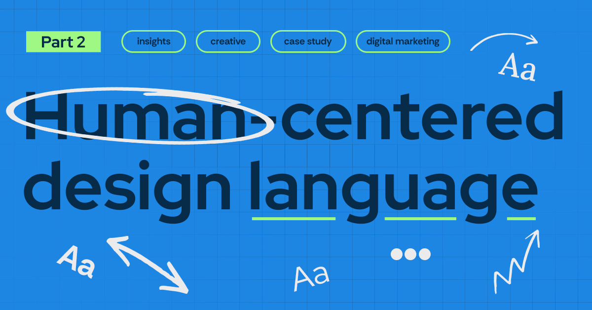
Finding Your Digital Design Language
Your brand’s design language is more than colors, fonts, and layouts. It’s the visual and experiential shorthand that tells customers who you are, what you stand for, and why they should trust you. In today’s competitive digital landscape, consistency isn’t just nice to have, it’s the difference between blending in and breaking through.
Our approach goes beyond surface-level aesthetics, making your website both beautiful and functionally aligned to attract, nurture, retain, and grow customers. Integrating data-driven insights, AI-powered tools, and human-led creativity to craft a design language that doesn’t just look good—it works hard. Every visual decision is rooted in audience behavior, brand strategy, and your specific growth goals, ensuring your design system is a living, adaptable asset that can scale with your business.
If you’re ready to define or refine your digital identity and make every interaction with your customers more consistent, compelling, and conversion-focused, we can help you Make Every Message Matter™.