We interact with the digital world almost entirely through design and language.
The front end of websites? Design and language.
Mobile apps? Design and language.
Even the way software and technology are built relies on design and language.
Digital design language is the synthesis of visuals, structure, and interaction that shapes every digital experience. It’s the vocabulary and grammar used by brands when communicating online.
When it comes to CRM and loyalty, design language becomes even more powerful. Every email template, push notification, and loyalty dashboard speaks the brand’s voice visually and verbally. A consistent system not only makes the experience seamless but also reinforces trust, drives engagement, and keeps customers coming back.
Elements of Digital Design Language
We all know language is about more than just words. It’s a system of communication that people can instantly understand and act on. The same holds true for digital design. Just like any spoken language with grammar and vocabulary, a strong design language has its own rules and building blocks. When those pieces come together, they create clarity, consistency, and connection across every digital touchpoint.
- Color Palette: Defines primary, secondary, and accent colors.
- Typography: Font families, sizes, and usage rules.
- Iconography: Style and consistency of icons.
- Layout & Grid Systems: How elements are arranged on screens.
- Motion & Animation Rules: How transitions, hover states, or micro-interactions behave.
- Tone of Voice & Content Style: Consistency in how the brand communicates.
- Accessibility Standards: Contrast, font legibility, keyboard navigation, etc.
What Digital Design Language Communicates about a Brand
A brand’s digital design language communicates its identity, values, and personality by shaping how audiences see and feel about it. From color palettes and typography to motion and interaction, these design choices signal whether a brand is playful, premium, bold, or trustworthy. In essence, design language is a brand’s visual voice, showing who it is and who it’s for.
1. Personality & Voice
- Minimalist vs. bold, playful vs. serious.
- Example: Apple → calm, elegant, premium.
- Example: Vice → gritty, raw, rebellious.
👉 It shows how a brand wants to be perceived emotionally.
2. Credibility & Professionalism
- A polished, consistent design language signals trustworthiness and maturity.
- A messy or inconsistent one risks making the brand feel unreliable.
- Example: Google → structured, orderly, reliable.
3. Clarity = Ease of Use
- In Loyalty marketing, clarity drives action—if a customer can’t instantly understand where to click or what to do, you’ve lost them.
- Good design language communicates hierarchy and intent, making interactions effortless.
3. Target Audience
- The design reveals who the brand is for.
- Neon gradients, experimental typography → youth / creative audiences.
- Neutral palettes, accessibility-first → corporate, professional, or mass audiences.
👉 The design language is a signal of cultural alignment.
4. Differentiation = Competitive edge
- It visually sets a brand apart in a crowded market.
- A strong design language cuts through by making your brand instantly recognizable.
- Example: Spotify’s duotones and vibrant motion make it stand out from Apple Music’s minimalism.
5. Emotion = Connection
- Accessibility, inclusivity, innovation, or luxury all show up in digital design.
- Customers don’t stay loyal to brands because of discounts alone—they connect emotionally.
- Color, typography, and imagery work together to express the brand’s personality, mood, and values.
- Example: Airbnb’s design language → approachable, community-focused, human-centered.
- Example: Burberry digital → sleek, aspirational, luxury-driven.
6. Consistency = Trust
- A cohesive design system signals that the brand is organized, dependable, and intentional.
- A unified design language builds recognition across emails, apps, websites, and ads. This is critical in CRM & Loyalty, where brands need customers to feel “at home” every time they engage.
- Inconsistent design creates confusion and undermines credibility. Consistent visual rules reduce friction. It tells your audience: “This is us, and we’re reliable.”
8. Flexibility = Longevity
- A design language should be adaptable across platforms and formats—CRM, Loyalty, paid media, web, mobile—without losing integrity.
- The pieces work together but allow for creativity and evolution as the brand grows.
Why It Matters: Blaze Pizza Case Study
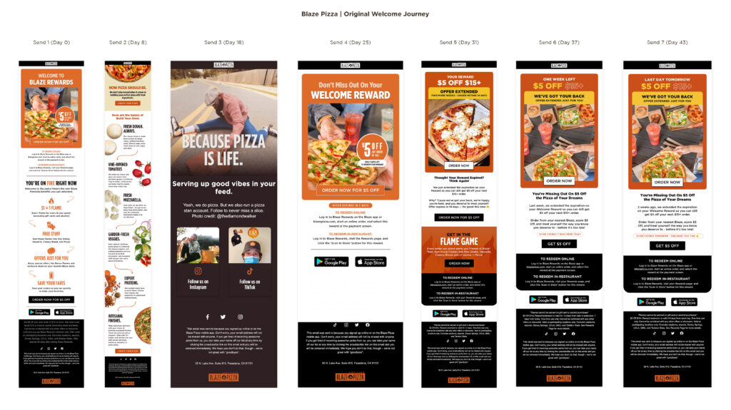
When Blaze Pizza partnered with Response Labs to refresh their Welcome Journey, the goal was simple: increase redemptions and drive customer engagement early in the lifecycle.
The original journey leaned heavily on static layouts and transactional messaging. We revamped the entire experience by introducing:
- Clearer hierarchy & messaging → customers instantly understood their next step.
- Fresh brand creative → more energy, consistency, and personality that aligned with Blaze’s voice.
Stronger visual system → color, typography, and motion rules that made every touchpoint instantly recognizable.

The Results
A welcome journey that didn’t just “inform” new loyalty members, but felt like Blaze from the very first click.
- +20% increase in Day 0 check-in rate
- +18% increase in Day 7 check-in rate
- +52% increase in Day 0 redemption rate
- +36% increase in Day 7 redemption rate
- +18% lift in sign-up-to-first transaction within 7 days
This is digital design language in action—not just making things look better, but making them perform better by turning communications into brand experiences.

Digital Design Language in CRM
At Response Labs, our Creative team knows that in CRM & Loyalty, a digital design language is more than aesthetics—it’s a strategic driver of trust, clarity, and emotional connection. By uniting color, typography, motion, tone, and accessibility into a consistent system, we help brands communicate who they are, who they serve, and why they’re different. When done well, design language makes every interaction—whether an email, app, or loyalty dashboard—feel seamless and recognizable, thereby strengthening customer confidence and deepening long-term loyalty. Ultimately, we Make Every Message Matter™.


